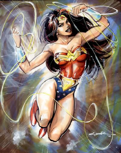
"Wonder Woman Copic markers, pitt pen, brush pen, pro-white and correction pen."I like this one a lot better than the sober piece from last week, especially that jubilant lasso work!
Yildiray Cinar
- 2012 Art Gallery: Mera @ The Aquaman Shrine
- 2008 Mister Miracle color art @ DC Bloodlines
- Classic Firestorm @ Firestorm Fan
- Sketches of Jason and Ronnie @ Firestorm Fan
- 2012 Aquaman art @ Justice League Detroit


2 comments:
Yes, this is a far superior picture, very light and cute and funny. It shows the fun, affectionate side of Diana's personality that we dont get to see anymore.
The lasso looks light-reflective; this could be done as one of those Day-Glo type posters, the ones that have a luminous feature to them.
Loving seeing her original costume once again; been a couple of years now and seeing it makes me feel quite nostalgic...all these prints, posters and pictures of her in her original get-up, not to mention all the available merchandise and DC STILL dont get it - this is how we all want to see our favourite heroine.
Cinar should release this as a poster, it'd sell.
You know, I really don't mind the newer costumes. The Odyssey one was fine without the jacket, and the current one would be fine if the boots were red. It's the written interpretation of the character that I find off-putting, not so much the wardrobe.
Post a Comment