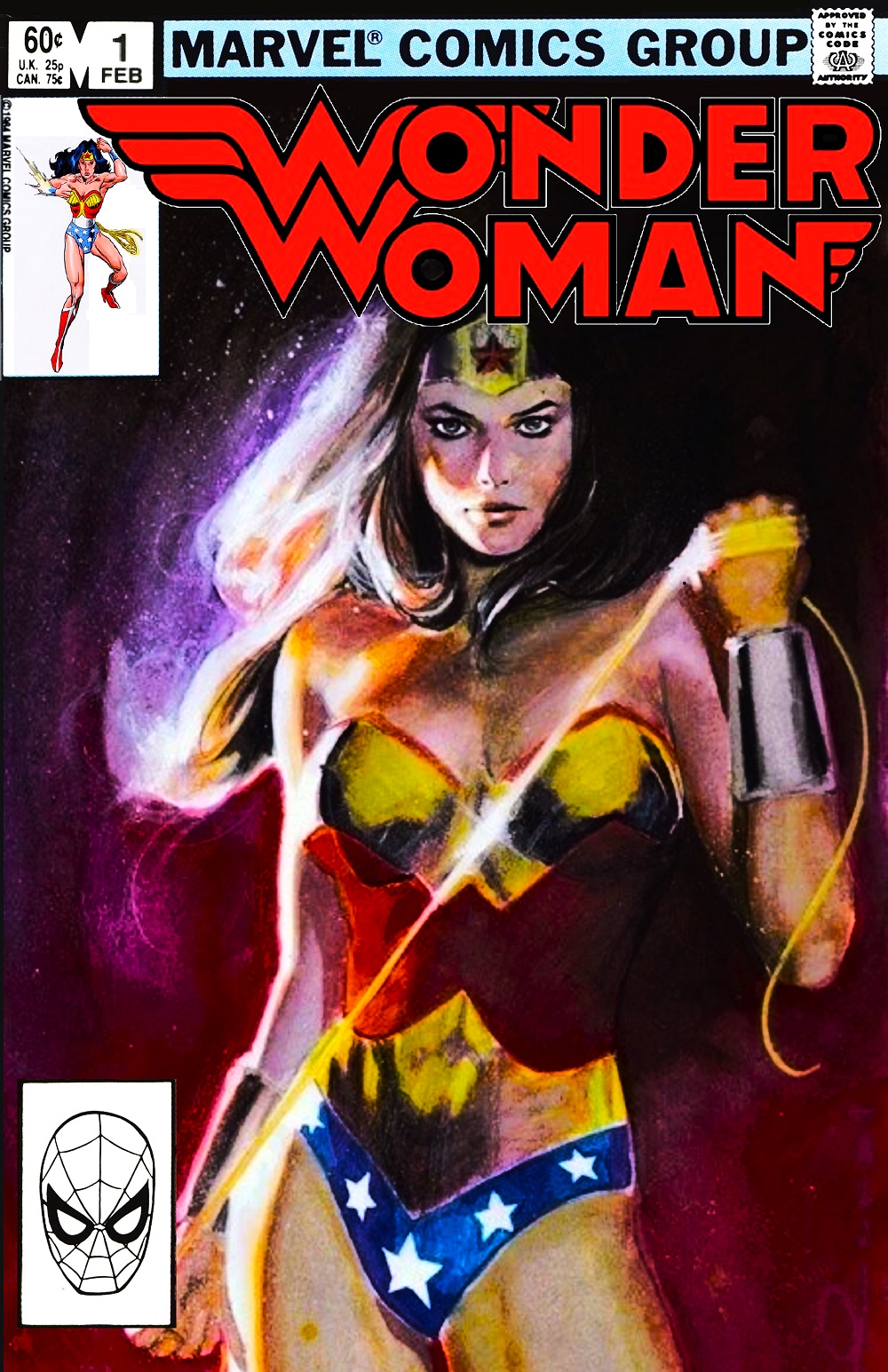
Way back in 2011, former Marvel Editor-In-Chief blogged about a time when DC Comics were seemingly so incapable of selling their iconic heroes to a modern audience, that a Warner Brothers mucky-muck tried to license them to Marvel. The story has been disputed, but when Newsarama recently revived the tale, it got my wheels spinning. For the article, they bashed together old Marvel trade dress with DC logos and stock art for Batman and Superman. I wanted to see what a 1984 Marvel Wonder Woman cover would look like, and so did my own bashing.
So right off the bat, the deal was supposedly offered in 1984, with probably no earlier than 1985 release dates. The class Marvel Comics Group banner was retired in 1983 for a more subdued Marvel logo in the corner box. That wouldn't be very fun, so this look is automatically anhistorical. I also wanted a "new" period logo, choosing a 1983 variant that was used on something like six non-consecutive Wonder Woman covers. However, I was only willing to put so much time and effort into this thing, so when I only found a transparency of the 1982 logo used for the Thomas/Colan run, I slapped that on instead.
I spent about an hour looking through artwork that could serve for the cover, which lead to the Ron Frenz corner box art. Even though Frenz spent a number of years at DC, his art style, crossing together both Buscema brothers, felt quintessentially Marvel. It was also a mostly white background, with elements that ended up being more work to remove than I'd hoped.
I finally decided to start Googling other period Marvel artists, and got a solid hit with a painted Bill Sienkiewicz piece. It looked like a period Wonder Woman, and Sienkiewicz did a lot of painted covers for Marvel in the early '80s, this one particularly recalling his Dazzler run. I wish I'd made the logo smaller to give everything, but especially the corner box image, more room to breathe. I was a bit sloppy and rushing, so it is what it is.
The most obvious creative team for a book like this would be Louise Jones or Mary Jo Duffy on scripts with maybe Mary Wilshire or Cynthia Martin art. Realistically, Marvel probably would have gone with either an all male or mixed gender creative team. To give the title more of a distinct flavor, being a relaunch and all, I went instead for rookies Ann Nocenti and Bret Blevins. Both had done work at Marvel, but not a lot, though I don't see why Marvel would have that much an easier time attracting name talent than DC. Better to find a hungry young team. I figure their book would have skewed more dark fantasy than Simonson mythology, and also be more urban. Something like the abortive Greg Potter run at DC, without all the really gross and creepy stuff. Definitely a "This isn't your grandma's Amazing Amazon" bold new direction. Given that my alternatives were a Perez-aping CAF artist or the gory Red Sonja-esque Frank Miller cover to LOC #1, I figure you guys got off lucky with this.
Subscribe to:
Post Comments (Atom)


No comments:
Post a Comment